The iPhone, since its inception, has transformed the way we communicate. From simple voice calls to Facetime, every update brought along something unique. Yet, the function of calls remains largely unaltered. However, with the release of iOS 17 beta 5, Apple has introduced a change that has iPhone enthusiasts and critics alike buzzing: the relocation of the “End” call button.
A Historical Placement, Shifted
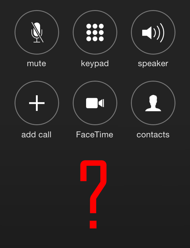
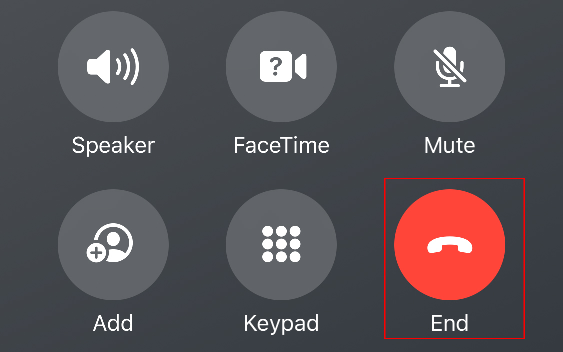
Traditionally located at the bottom-center of the screen, the “End” call button has been an integral and consistent feature of the iPhone’s UI. The latest iOS 17 beta moves this iconic red button, shrinking and relocating it to the bottom right corner. This shift is not merely cosmetic. There’s speculation that many might inadvertently hit “Keypad” or “Facetime” in place of ending a call due to muscle memory from years of a centralized button.
The Rationale: Contact Posters
Why make such a contentious change? The answer lies in one of the central features of iOS 17: the Contact Posters. These are full-screen images that display when in a call, replacing a significant portion of the traditional phone call interface. With Contact Posters, users see an image representing the person they’re conversing with, amplifying the connection and personal touch during voice interactions.
To accommodate this full-screen representation and ensure it isn’t obscured by other buttons and icons, Apple appears to have shifted the call controls, placing the poster center stage.
A Polarizing Decision
The redesign has been met with mixed reviews. Some users, familiar with Apple’s history of bold design decisions, are willing to wait and experience it firsthand before passing judgment. There’s a sentiment of adaptability among the community, as noted in 9to5Mac’s comments, where a user mentioned adjusting to the previous Safari address bar relocation.
On the other hand, many see this change as a potential hindrance, disrupting years of built-up muscle memory and familiar functionality. Gizmodo and CNBC’s coverage has amplified these concerns, emphasizing the possibility of users activating unintended features due to the button’s new placement.
A Beta’s Nature: Potential for Change
It’s crucial to remember that this is still a beta release. As with past iOS beta versions, Apple often tweaks features based on user feedback and testing. An illustrative example is the shift of the browser bar in Safari during iOS 15’s beta phase. Initially moved from top to bottom, Apple reverted to the traditional placement by the time of official release after considering user feedback.
Similarly, Apple’s open beta process for iOS 17 has demonstrated their responsiveness. They’ve revised the automated voicemail response based on the feedback they received during the beta phase.
In Conclusion
Apple’s decision to relocate the “End” call button in its iOS 17 beta ties back to its commitment to enhancing user experience, even if it means challenging established norms. While some argue against tampering with a well-settled feature, others welcome the innovative approach that showcases full-screen Contact Posters. As the release of the finalized version of iOS 17 and the iPhone 15 nears, users and critics await to see if the redesigned call button will remain or if Apple will once again prioritize user familiarity over new design elements.